
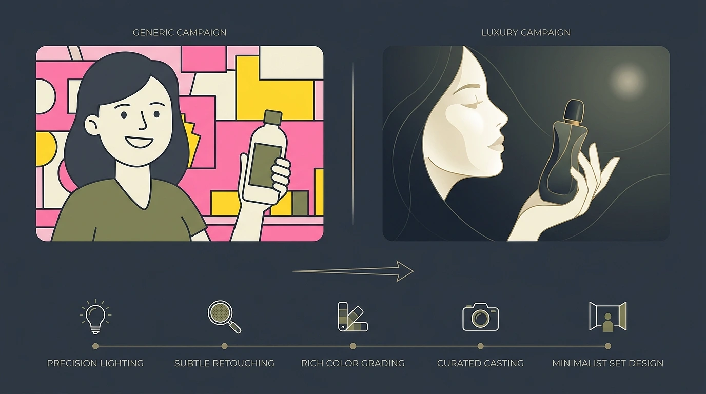
You’re flipping through a magazine, or scrolling late at night, and a campaign just stops you. You can’t explain why at first. The skin looks different. The colors hit deeper. There’s a stillness to it a quiet confidence, like the brand doesn’t need to convince you of anything.
Then a few pages later, another beauty ad shows up. Probably similar budget. Sometimes even the same model. And it just lies flat on the page.
One feels like Chanel. The other feels like something you’d walk past in a pharmacy aisle.
Honestly? It’s never one big thing. Luxury in beauty is quiet work. It’s built from a hundred small decisions most people never consciously notice but always feel in their gut.
I’ve spent years studying the campaigns that define a brand versus the ones that just fill a content calendar. And the same five details keep showing up, again and again.
1. Lighting That Actually Respects the Skin
Want the fastest way to spot a campaign that cut corners? Look at the skin.
Cheap lighting flattens everything. It wipes out texture, smooths the face into something weirdly plastic, and leaves behind that waxy glow you can clock from across the room.
Luxury campaigns go the other way entirely. They light for the skin, not against it.
In practice, that usually comes down to a few specific choices:
- Big, soft light sources a softbox the size of a small car, or natural light bounced through silk until it falls just right.
- Careful negative fill on one side of the face to give it shape and dimension.
- Lighting that preserves texture instead of erasing it.
The goal isn’t to polish the model into a doll. It’s to let her breathe.
Because here’s the thing pores, fine hairs, the faint flush under a cheekbone, that little shine on the bridge of the nose those are the details that make a face feel alive.
Strip them out and you’ve got a mannequin. Keep them, and suddenly the image has a pulse.
2. Casting That Goes Beyond “Pretty”
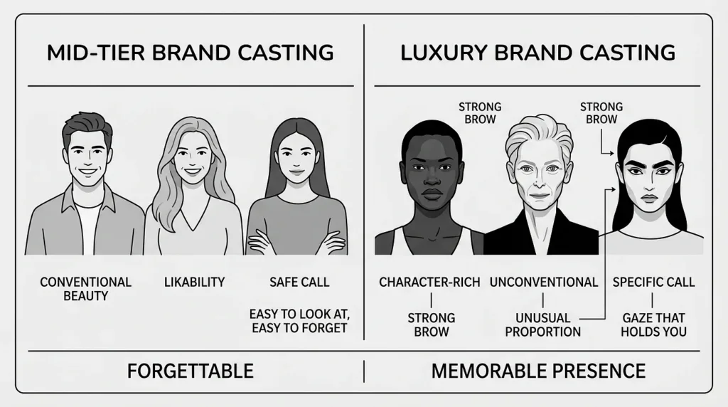
Here’s something people don’t talk about enough.
Luxury campaigns almost never cast the most conventionally beautiful person in the room. They cast the most interesting one.
There’s a reason the big houses keep coming back to faces like Alek Wek, Anok Yai, and Mona Tougaard. Or, on the opposite end, character-rich choices like Tilda Swinton and Charlotte Rampling.
None of those are safe calls. They’re specific.
A strong brow. An unusual proportion. A gaze that holds you a second longer than it should.
That extra second is everything.
Mid-tier brands cast for likability someone easy to look at, easy to forget. Luxury brands cast for presence.
And once you start noticing it, you can’t unnotice it. It’s in every frame.
3. Sets and Locations That Feel Built, Not Borrowed
A luxury campaign almost never looks like it was shot in a rented studio against a seamless paper backdrop even when, technically, that’s exactly what happened.
There’s a layer of craft sitting on top. And when you start breaking it down, a few things tend to separate the built-feeling sets from the borrowed ones:
- Custom wall treatments instead of standard backdrops.
- Real materials a slab of marble flown in for one shot, proper wood floors, aged plaster.
- Tactile, considered props instead of whatever the prop house had lying around.
And when these campaigns go on location? The choice feels deliberate. Almost devotional.
A Mediterranean villa picked specifically because of how morning light hits one stone wall. A forgotten corner of a museum. A hotel suite chosen for the way afternoon light falls across the floor at 4 p.m.
Compare that to a “beach campaign” shot at whatever beach production could book on a Tuesday and yeah, you can feel the difference.
Luxury productions spend real money on things the viewer will never consciously register. The right floor. The right paint color. The right window.
It’s the production equivalent of a bespoke suit versus one off the rack. Same silhouette on paper. Completely different feeling when it walks into the room.
4. Restraint With Product and Styling
This one feels backwards at first, so stay with me.
The most luxurious beauty campaigns often show less of the product, not more.
A mid-tier campaign shoves the bottle into every frame. Heroes it from every angle. Slaps the logo across a third of the image, just to make sure you got it.
The product might appear in just one or two frames of an entire film. Sometimes it’s held at an angle that half-covers the label. Sometimes it’s not there at all and the whole campaign is about the feeling the product creates, not the product itself.
That same restraint shows up across every other layer of the image:

- One perfect piece of jewelry instead of three competing for attention.
- A bare shoulder instead of a fully styled outfit.
- An empty background instead of one crowded with detail.
Every removal is a decision. And every decision adds weight to whatever’s left behind.
5. Post-Production That Knows When to Stop
This is where campaigns really show their hand budget and taste, both at once.
Over-retouching is the fingerprint of work trying to look expensive.
Under-retouching, done with skill, is what actually is expensive.
High-end post teams will spend hours on things you’d genuinely never notice. Matching the warmth of a hand to a face across different setups. Removing one stray hair without flattening the rest of the head. Color-grading the whites until they go creamy instead of clinical.
The skin texture stays. The asymmetries stay. The humanity stays.
Cheap post does the opposite. It smooths everything into the same waxy surface. Cranks the saturation. Crushes the shadows until the whole image reads like a filter someone found on their phone.
And effort, in this world, is the quickest way to kill luxury.

Add comment