
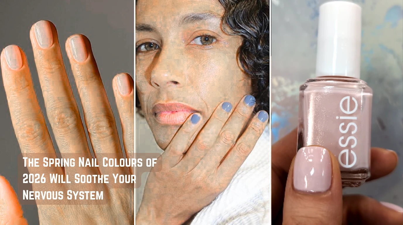
If you’ve walked past a salon window in the last month and felt like the colours looked, somehow, quieter you weren’t imagining it. The shade cards have shifted. Loud is out. So is anything that reads as “trying.” What’s replaced it is a palette that genuinely seems engineered for people whose group chats are stressful and whose sleep is mediocre.
The shades doing the work this spring fog blue, butter yellow, creamy matcha, sage, milky neutrals, refined pastels, and one outlier brick red share the same DNA. Muted. Softened. White folded in. None of them are competing for attention, which, paradoxically, is why they’re getting it.
Key Trends & Colors for Spring 2026
- Brick Red & Berry: For a punch of color that is grounded and not too dramatic.
- Fog Blue: A moody, calming blue that represents a need for peace in complex times.
- Butter Yellow: Described as the “it” color, a soft, creamy yellow that is sophisticated and warm without being neon.
- Matcha & Sage Green: Gentle, natural greens that provide a calming, muted aesthetic.
Tranquil Fog Blue
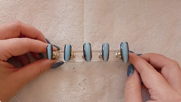
Start here, because this is the shade everyone in the industry is naming when asked what spring looks like.
Grey is folded into fog blue, a gentle, somewhat dusty mid-blue. nor slate (too chilly), nor denim (too saturated), and not powder blue (too sweet). The color of a window in the early morning before the sun has burnt off the haze is the reference photograph, if you need one.
The manicurist of JINsoon, Jin Soon Choi, who did the nails for Jason Wu’s spring/summer 2026 show, has discussed why a dark blue is appropriate right now: it doesn’t strive too hard, yet it still looks fashionable. That sums up the appeal in a single statement. Adults who don’t want to explain their manicure should choose this color.
Additionally, older readers will notice the echo of the 1990s right away. One of the most iconic colors of that decade was Hard Candy’s original powder blue, which was included with the plastic ring. 25 years of taste correction have been applied to the identical concept in the 2026 edition. less sweet. Tuesdays are more wearable.
- Best on: short to medium nail length, glossy finish, one coat for sheerness or two for full opacity.
Butter Yellow (and Why Lilac Lost its Spot)
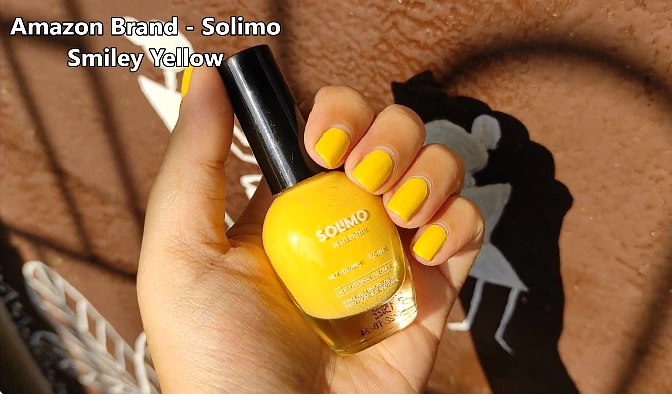
Lilac had a genuinely long run as the “it” pastel somewhere around three full seasons. Its replacement is butter yellow, and the swap makes sense if you’ve been watching the broader fashion palette move warmer.
Butter yellow is not what most people picture when they hear yellow nails. It’s not highlighter, not banana, not mustard. It’s the colour of softened butter sitting on a counter cream with the faintest yellow pull, warm enough to flatter most skin tones, muted enough that it functions almost as a neutral.
A few things to know about wearing it:
- It works best in creamy formulas, not jellies. Jelly finishes make it look unfinished. Cream finishes make it look intentional.
- It photographs warmer than it looks in person. If you’re picking it for an event, swatch it in natural light first.
- It pairs surprisingly well with denim, white linen, and anything in the broader “quiet luxury” category that’s still dominating spring wardrobes.
This is the trend most likely to outlast the season and become a permanent staple. Butter yellow doesn’t have an expiry date the way harder trend colours do.
Creamy Matcha and Sage
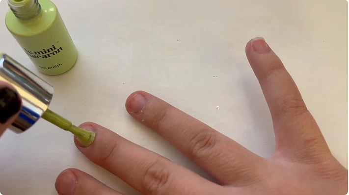
Green has been trying to happen in nails for two seasons. This is the one where it lands properly, partly because the green being pushed is so soft it barely registers as green.
- Creamy matcha is the warmer of the two. Picture the foam on top of a matcha latte pale, yellow-tinted, slightly chalky. It reads almost like a green-neutral and works on people who normally avoid green because they find it cold.
- Sage sits next to matcha but pulls cooler and slightly more grey. Think of dried sage leaves, not fresh ones. It’s the more sophisticated of the two and the more polarising it can look beautiful or institutional depending on lighting and skin tone.
Both shades depend heavily on finish. Glossy makes them look fresh. Matte makes them look chalky and a little sad. If your manicurist asks, say gloss.
Sheer and Milky Neutrals
This is the trend that’s hardest to describe and easiest to overdo.
The category covers two adjacent looks: milky whites (warm off-whites with a hint of opacity, sometimes called Cloud Dancer after the OPI shade that defined the trend) and sheer nudes (washes of pinky-cream so soft they look like your nails on a good day).
The defining feature is the finish, not the colour. These are meant to look like skin clean, healthy, slightly glossy, never fully opaque. Bana Jarjour, the Los Angeles-based nail artist quoted in Allure’s coverage, described the sheer-white look as feather-light, almost like glossy cellophane. That’s the texture you’re going for.
A warning: this trend is unforgiving on nail beds that aren’t in good shape. Ridges, yellowing, lifting all of it shows through. If your nails have had a rough winter, it’s worth doing a buff and a treatment week before attempting this.
Modern Pastels (Not the Ones From Your Childhood)
The Easter-egg pastels of past springs that sugary baby-blue, that chalky lavender are gone. What’s replaced them is a desaturated, slightly greyed-out version that reads as adult pastel.
The key differences:
- Powder blue 2026 has more grey in it. Less Tiffany box, more weathered ceramic.
- Pale peach sits warmer and pinker than before, close to the inside of a seashell.
- Soft lavender has been muted so heavily it almost reads as a cool grey in low light.
The shift is partly about saturation and partly about what these colours are paired with. Pastels used to belong on nails that wanted to look young. The 2026 version belongs on nails that want to look considered.
Brick Red the Outlier Worth Knowing About
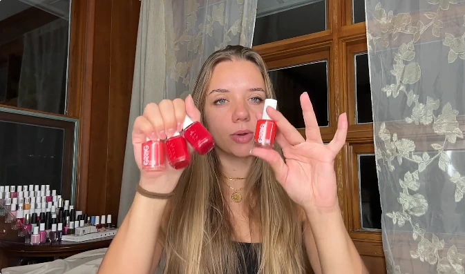
Not every shade this season is soft. Brick red is the one that breaks the pattern, and it’s worth flagging because it appeared on actual runways rather than just trend forecasts.
Brick red sits between red and terracotta earthy, slightly burnt, more grounded than a true red and warmer than a maroon. Choi used JINsoon’s polish in Idyll for the Jason Wu show, and Orly’s “In the Conservatory” is the high-street pick that gets mentioned most often, leaning slightly more terracotta.
This is technically a winter colour repurposed for spring. It works because the rest of the season is so soft that brick red functions as the dark anchor the way a single dark room in a pale-painted house draws the eye.
A note on finishes, because this season is unusually fussy about them
You can pick the right colour and still get it wrong if the finish is off. Spring 2026’s defining finish choices:
- Sheer is dominant. Even shades you’d expect to be opaque fog blue, brick red are appearing in semi-transparent formulas. One coat is often enough.
- Gloss over matte, almost across the board. The exception is some of the muted pastels, which can take a satin finish. Full matte makes everything look dusty.
- Skin-finish for neutrals. The milky and nude trends want to look like clear gel barely there, very smooth, no obvious polish line.
If you’re getting a manicure done professionally, mention the finish you want before they start. It’s a faster correction than the colour itself.
So What Should You Actually Pick
Honest answer: it depends on how much you want your nails to be doing.
If you want the most-of-the-moment shade, fog blue. It’s the one that will look most like 2026 in retrospect.
If you want something you’ll still wear in October, butter yellow or a milky neutral. Both are long-lifers.
If you want green without committing to looking like you read trend forecasts for a living, matcha, kept glossy and short.
If the entire palette feels too quiet for you brick red, no apologies needed.
The throughline is that none of these shades are loud. Whether that’s calming or boring depends entirely on what your last six months have looked like.



Add comment